The Challenge
“January 2019 will be a dual-mode month. The reason for that is because I want to make it a terrain month. … So the other option for the month will be Centrepiece Models.”
For more details regarding this Community Miniature painting challenge, please check out Azazel’s site: https://azazelx.com/2018/12/24/january-2019-paint-challenge-terrain-centrepiece-models
Inspired mainly by Death Ray Designs Necromunda style walls, I had decided long ago to try to do something similar but without the expensive shipping. Note: the shipping price has dropped dramatically since I first investigated their product….if only I had known! These walls would be great for providing atmosphere to the more 2D Zone skirmish option of Necromunda. Inspiration also came from seeing terrain on lots of other sites, in particular I’ve been a big fan of the terrain setup shown on Alex’s Lead Ballooney site.

They look fantastic. They certainly lift up the basic flat boards. Did you plan out how many you need of are you making them as you fancy it?
Cheers,
Pete.
LikeLiked by 3 people
Thanks Pete! Yea, I think I had initially planned it out, but then lost the info. You basically need 24 of the larger blocks, as that’s about the maximum you will ever see on a 6 tile setup. Then you just have to decide whether to combine blocks or not. I’ll end up having a mix of 1 large + 1 small, individual small ones, and 2 small blocks combined. The bonus is that I should be able to reuse for other games, if needed.
LikeLiked by 2 people
They all look good to me. They certainly set the scene in the final shots. Just goes to show just how much good scenery adds.
LikeLiked by 2 people
Thanks TIM! Yea, it’s amazing how the tone starts to get set with a few pieces of scenery. In our first game, I couldn’t find the black blocks, and I grabbed a big lego block for a wall. The kids yelled at me that it looked totally out of place. Haha!
LikeLiked by 1 person
I like them all, but 1 and 4 jumped out at me most! I think the combination of grime, rust and blood splatter works well, but the cleaner ones (well, OK, the less grubby ones) fit nicely with them. Great stuff! If there’s one thing I can’t do it’s irregular, haphazard stuff, so well done you!
LikeLiked by 2 people
Thanks for the feedback, John! Yea, those two are what I’m hoping to carry forward for the rest of them. Glad to know I’m on the right track then. The red was actually supposed to be rust, but blood works too! I did end up finding a darker/red brown later on to replace the brighter red. I think it got used on 7-9. The haphazard stuff is not too hard to pull off. I started with just an old paint brush, but then found the sponge a way better tool. Probably a mix of the two ends up a better result. But after awhile, the painting part would just start to fall in place and feel natural.
LikeLiked by 2 people
Nice man. I like the chunky rust style you’ve gone with
LikeLiked by 3 people
Thanks IRO! Still surprised I was able to pull it off with craft paints. When I first tried craft paints on bases, it was a disaster. Still learning, but it’s getting there!
LikeLiked by 1 person
Very “rustic” looking pieces mate. Good job!👍🏻👍🏻
LikeLiked by 2 people
Haha, thanks savageddt!
LikeLiked by 1 person
They look excellent, well done. They’ll be great to play Necromunda (or Infinity etc) across.
LikeLiked by 1 person
Thanks AB! I’ve yet to check out Infinity, but it’s a ruleset I might want to be looking into.
LikeLike
Looking pretty good! Ryza Rust is a bit brighter than I prefer for my rust, but it works. What are the bits on the sides of #2 and 5? The ones with all the gears and handles and such.
LikeLiked by 2 people
Thanks Alexis! It’s all craft paint, no Ryza was harmed in the process. 😉
Most of the bits you are seeing come from Tehnolog sets that I got off of Ebay. Platformer and Chemical Plant have been really useful. Those specific bits form the base on the Platformer set, which you can see in the pic below.
http://www.ironhands.com/tehnolog.htm
LikeLiked by 1 person
I would have sworn there was some mention of Ryza Rust in the post. Ugh. Sleep dep: It’s a hell of a drug.
Thanks for the pic there. The Technolog and Pegasus stuff is pretty cool, but I find it hard to consistently get hold of, so I’ve never really gone in for it.
LikeLiked by 1 person
It certainly looks like it could be Russ in some spots, so won’t hold it against you! I think much of that was I tried adding some yellow in, but ended up way too bright.
Yea, I was having a tough time figuring out how to decorate the blocks at first. Contemplated, cutting small wood or plasticard pieces, using GW bits, computer parts, etc. Then I finally found some Tehnolog stuff, and that seemed just about right. Granted not all of it worked for this project, but leftovers can likely be used for other stuff.
LikeLike
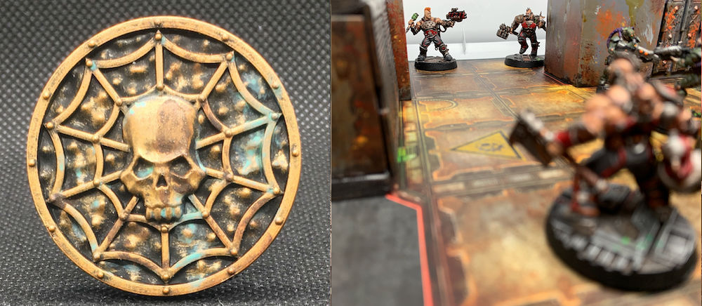
Nice set. I’d vote for #5 and #7 for no other reason than they caught my eye while I was scrolling through the pictures. I also rather liked that skull-web-coin thingie too; you did a nice job with that.
LikeLiked by 1 person
Thanks Ann! The skull coin, is a token in Necromunda to keep track of who won initiative that round.
Interesting, so #7 was one of the first blocks I did. I believe it was primed black, then drybrushed with some dark metallic craft paint. Then it got a couple layers of Agrax and other wash to try and bring down the shine. I think I even over brushed some grey on it later. I had a really tough time with it, as it ended it up too dark. So I poked around on the web, and finally decided the first coat should be grey, which is why all the else ended up like they did. I do kind of like how the panels have a very metallic, almost ‘vault like’ appearance to them. So I might carry that over to other pieces later on.
LikeLiked by 1 person
Oh, I see. A nice job in any case on the token.
Huh, it just stood out to me as different than the usual rusty terrain I usually see so I think it was the novelty that I liked. Not that I’m any great hand at weathering stuff myself, but what I like to do for inspiration is look at rusty cars or old buildings I run across rather often in my bus driver travels, when I’m sitting at stop lights and the like.
LikeLiked by 2 people
Yea, it’s funny how different rust can look. I find myself looking at rust spots on walls, dumpsters, etc. quite often too. On walks, I often notice how different things end up weathered and dirty/grimy. I tend to stay away from areas that look like the underbelly of the Necromunda Hives though, so this is about as realistic as I can get. 😉
LikeLiked by 2 people
Yeah, catching Nurgle’s Rot in a game is funny, in real life I’m not so sure!
LikeLiked by 1 person
Very nice indeed, really brings a more claustrophobic atmosphere to the 2d tiles. If I had to pick a favourite I’d say probably 7 or 9, I really like that dark and dirty metalwork.
LikeLiked by 1 person
Thanks Wudu! Interesting choices, I had to go back and look at 9 to see if I had first dry brushed it with Metal paint like I had done for #7. I actually didn’t. #9 was black primer, grey primer, and then some heavy dark wash. It actually turned out darker than I preferred, and probably won’t go in that direction again. After that, rust and washes are applied, and then finally some highlights of leadbelcher.
Those two do kind of remind me of the dark metal look I’ve seen you pull off quite nicely. But in person, I feel like they turned out too dark and it took a lot of effort to get any of the washes or other details to show up.
On the other hand…if the walls are darker, they probably won’t attract too much attention and people will focus on the minis more. If only this stuff were easier! ;P
LikeLiked by 1 person
6 and 9 for me! Well done! These would work nicely in 3d setting with some walkways between them. With the weight of the wood they’d probably work well as a base for a modular tower as well.
LikeLiked by 1 person
Thanks CS! Looks like two votes for 9. I do like that one pretty well. I hadn’t thought too much about carrying those over to 3D, but those are really good suggestions. I’ll have to play around with some walkway ideas.
LikeLiked by 1 person
I like them all, but 9 is my favorite
LikeLiked by 1 person
Thanks Mark! 9 seems to be pretty popular. At least photo wise, it looks like there is some good contrast between the rust and the darker grime elements. I’ll keep that in mind when painting up the next batch.
LikeLiked by 1 person
They look good. I’d vote for 2 and 8. The first as I like the bright colour with the curves. The second as it reminds me of industrial sized ovens and I think the little bits of orange set it off nicely.
LikeLiked by 1 person
Thanks BttH! The curves on #2 are from the wood grain. I was hoping to mask that, but oh well, it does add an interesting effect. Oh yea, I can see that on #8. The colors did turn out pretty nice on that one. I had started using a darker brown, but also experimented with a brighter yellow. It was actually too bright, so I had to tone it down with the orange and various washes.
LikeLiked by 1 person
Hey man, I hope you’re well. Haven’t seen you around for a bit. I hope all is ok in your neck of the woods
LikeLiked by 2 people
Hey IRO, doing all right. Just buried in work and not much has happened on the painting front. Life happens sometimes, but I hope to get caught up reading blogs slowly, and get back to painting.
LikeLiked by 2 people
Ahh ok man. Glad to hear you’re ok. You don’t know me from Adam but I was a little worried when I didn’t see any posts or comments from you. Stay cool man
LikeLiked by 1 person
You too! Don’t worry, I’m not that old yet, haha!
LikeLiked by 2 people
Haha 👍🏼
LikeLiked by 1 person
These look great – especially once in-action. As for best tile, that’s a hard call, especially only seeing the one side of each! So I’m going to go for the “ensemble” answer. 🙂
LikeLiked by 1 person
Haha, thanks man!
LikeLiked by 1 person
Hi Mate, a few of us were saying we hadn’t heard from you lately so I thought I would drop you a comment to see if everything was OK at your end? All the best.
LikeLiked by 1 person
Hi TIM, I am alive, thanks for checking! I just made a post on my site letting people know I’m ok and what’s going on in my little world. Cheers!
LikeLiked by 1 person